Wallpaper for Banking Computer System
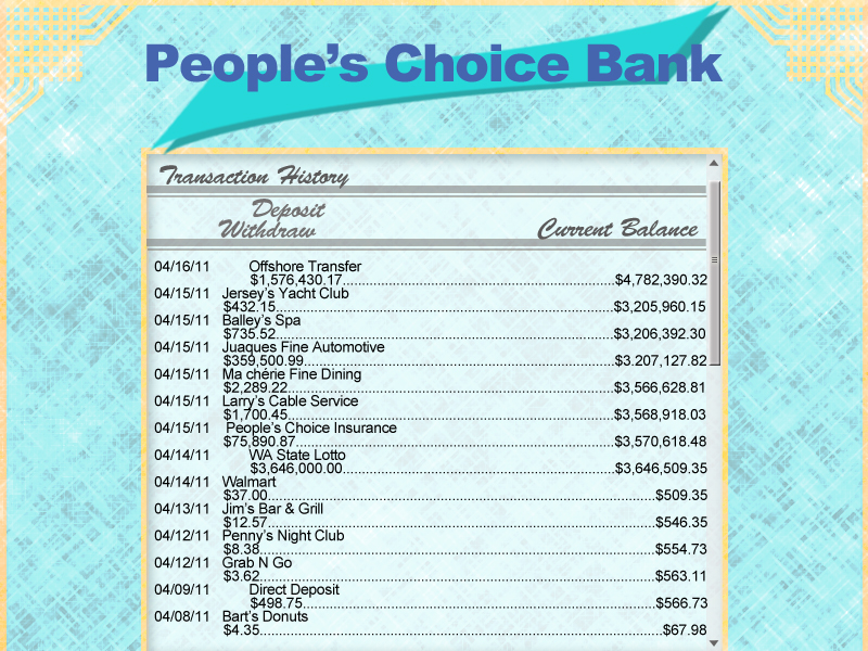
Here I wanted to create an environment that is easy on the eye and also has a sophisticated look to help establish the company's professionalism in their branding. I feel that the subtle cool blue tones would create a comforting atmosphere
to work in for the consumer and help mitigate some of the anxiety that can be associated with finances.
to work in for the consumer and help mitigate some of the anxiety that can be associated with finances.
Background for a Sparkling Beverage

Here it's all about the product and the way it makes you feel. A fun splash to grab the attention of the consumer. I try to keep the colors down to a minimum to give the overall format a uniform look. I also want to create a fair amount of contrast in key areas to help the eye move towards product focal points. The Brown tones help convey the texture and taste of cola, and the blues help it feel crisp, cool and refreshing.
Cola splash photograph, courtesy of Paul at freedigitalphotos.net http://www.freedigitalphotos.net/images/view_photog.php?photogid=1526
Cola splash photograph, courtesy of Paul at freedigitalphotos.net http://www.freedigitalphotos.net/images/view_photog.php?photogid=1526
Background for a Blackberry Ad
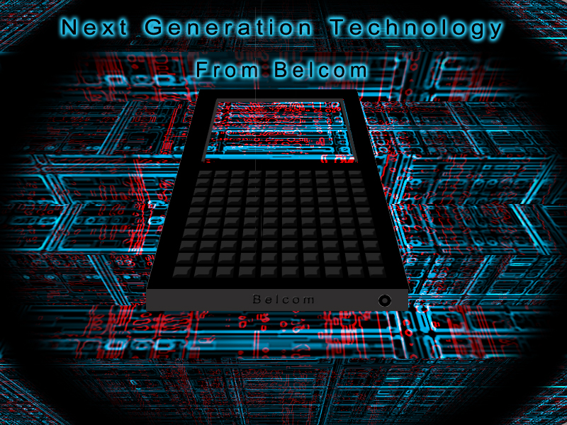
I know this looks like way more buttons than your average BlackBerry. In reality I would use a photo of the actual product, but here I wanted to challenge myself to see if I could simulate a descent grid pattern using photoshop tools. This ad is all about giving the product a high tech and electronic atmosphere. You can almost feel the electricity pulsing through the nodes of the circuitry. I use the perspective angles to give it more depth on a 3 dimensional plane and to give the product a feel of hovering like an alien space craft. The blues give it a shockingly electric feel, while the reds create contrast, and radiate a warm vibrancy which I think would help draw the consumer's eye among a sea of ads. To top it off I give it a black halo to give the eye a place to rest amongst all the busy circuits.
